
PORTFOLIO OF ARTWORK
Title: "Lovers to Strangers"
(FEATURED)
Media: Ink pen, acrylic paint pen
Size: 32in x 30in
Date: May 28 2015
Conceptual Meaning:
4 years ago on this day, I gave my heart to the first and only individual I have ever experienced romantic love with. We spent two years every day of our high school lives with
one another. In those times, we were in the beginning phase of self exploration. We began to understand ourselves, deeply analyze our minds, decide what our wants and needs were, all while trying to decipher the mystery of our world around us. But in the midst of all this, we had failed to grow with each other and the universe forced us to take our own separate paths. I have thought about this person everyday for two years. It pains me to say that I can only see your face in my dreams, and almost every night it has pleasantly haunted me. I do miss your memory. I wish I could say I knew about who you are now. I wish I could have been as strong, positive, vibrant and self aware as I am now, but I truly couldn't have known without being on my own. I don't know who you have grown into or what you have learned or what memories you have had in the time being...I just know that your nostalgia aches me, and I don't think your energy will ever escape my soul. I hope for you to thrive in your dreams, love and balance yourself, laugh and smile brightly, create your fantasy, experience the wonders of people and your creative mind, grow with yourself and live a beautifully connected and happily fulfilled life.
Formal/Technical Process:
Took 26 hours to sketch and draw over with ink pen. Based on the past destructive relationship between my first love and I. I incorporated elements of balance & third eye connection. The feeling is harmonious yet chaotic. I represent symbols of eyes, flowers, triangles, fractals, warped designs. The third eye is a representation of visions seen by both lovers.
CHRONOLOGICAL
Title: "Pacific Northwest Diamonds" Tattoo designs
Media: Ink pen
Size: 20cm x 28cm
Date: November 2014
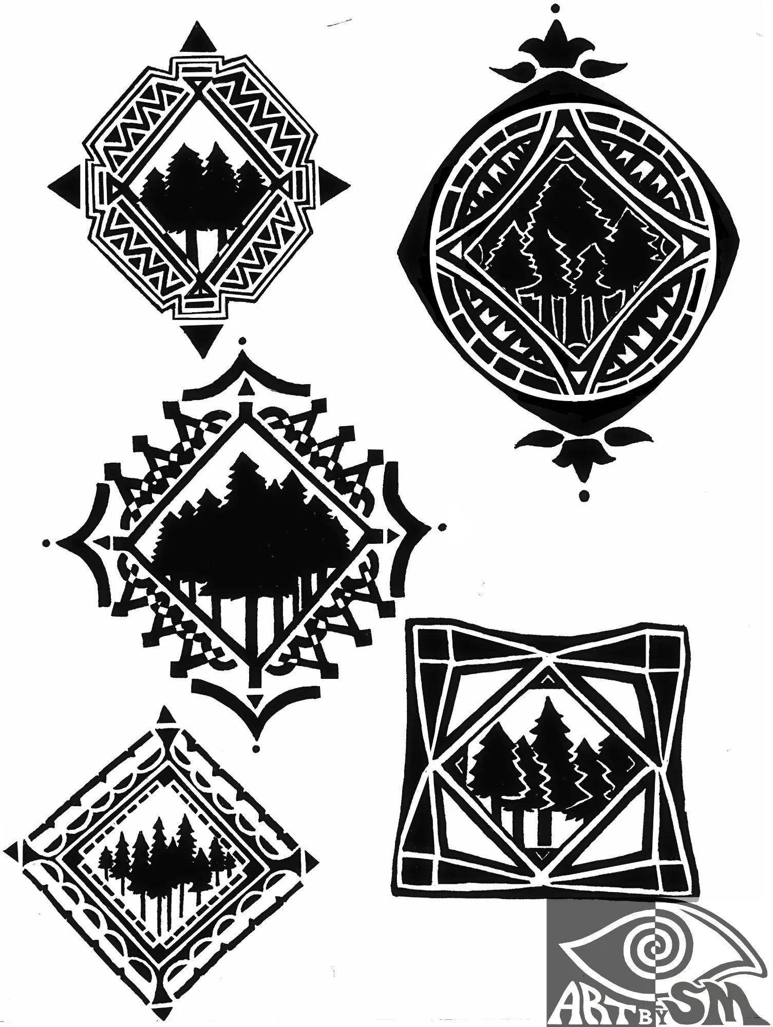
Formal/Technical Process: This piece was taken from a request from a girl watching me draw in class who wanted ideas for tattoos. She asked me to include a diamond-shape and PNW trees.
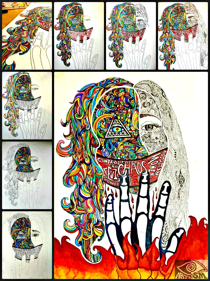
Title: "Darker Side of Self"
Media: Ink pen, sharpie
Size: 11in x 9in
Date: December 2014

Conceptual Meaning: This piece has a deep emphasis on depression washing over my self identity. This piece was drawn during a very dark time in my life, and this was my perception of who I became during that period. I show themes of aesthetic chaos and harmony. My internal strife (black/white) bleeds through scalp into an array of colors
"The blood stain, from my past pain, will remain."
Title: "Solarado" tattoo designs
Media: Ink pen, minor computer edits
Size: 11.5in x 8in
Date: October 2014
Conceptual Meaning: These were done for a friend who requested "sun" in different variations.
Formal/Technical Process: This was the beginning to learning the Microsoft paint-like online photo editing program called "ipiccy.com". Used this as a resource to fix minor issues.
Title: "For Summer"
Media: Ink pen
Size: 10in x 6in
Date: September 2014

Conceptual Meaning: Designed for a friend named Summer where she asked me simply to draw her a tattoo so my hands created this piece.
Formal/Technical Process: Symbols of symmetry, balance, duality in the third eye of horus, lotus flowers, Egyptian ankh, mushrooms, sun & moon, yin & yang.
Title: "Novus Ordo Seclorum"
Media: Linoleum print
Size: 10cm x 15cm
Date: May 2014

Conceptual Meaning: With themes of eyes and triangles emerging, this is a prominent piece displaying my interest in these symbols.
Formal/Technical Process: Carved into a linoleum print- this piece was lathered with multiple primary colors and hand-printed onto inidivual papers. The outcome is this tie-dye splotch design.
Title: "Paisley Bone Font"
Media: Ink Pen
Size: 10cm x 6cm in each individual rectangle
Date: October 2014

Formal/Technical Process: This piece was inspired by the textile paisley design along with my own representation of "bones" in a separated line form.
Title: "Separated Fractal"
Media: Hand drawn with ink pen
Size: 30cm x 22cm
Date: December 2013

Conceptual Meaning: In this piece, I was inspired by what my parents once were. Their separation tore me apart, but more significantly, the external factors of the universe tore 30 years of marriage apart. With much time of acceptance and healing, I've realized it may be better this way. The family pain of my past is no longer raw, but only a scar of a memory now.
Formal/Technical Process: Completed in ink pen, I created this piece over several hours of intricate detailing. This piece was the first vision of people, balance and synchronicity themes seen in my later works. The middle spiral represents the external factors & limitations of the universe which diminished their relationship. I tried to portray elements of feminine/masculine energy within these silhouettes of my parents.
Title: "Bicycle Silhouette"
Media: India Ink
Size: 22in x 30in
Date: September 2012

Formal/Technical process: Created in my first ever art class. The professor set out random items and instructed us to create a silhouette. This piece lacks emotional attachment-this is purely for developmental purposes.
Title: "Read the Words in the Stars"
Media: Ink pen
Size: 10in x 6in
Date: May 2012

Conceptual Meaning: This piece was first abstract piece that I had done as a sophomore in high school. This piece (nor are any of my pieces) is NOT INSPIRED BY DRUGS, but this type of art was the beginning to my own individualistic monochromic work. If you look deeply in this piece, what does it read? (Hint: Starts with a B, which is the theme in ALL of the work I've done past this)
Formal/Technical Process: Drawn on the back of a notebook flap, I drew this piece with ink Faber Castell pens.
Title: "Seven Sin Mask"
Media: Hand-drawn & painted with ink pen, watercolor
Size: 12in x 10in
Date: April 2012
Conceptual Meaning: This piece I had done as a very young girl in the midst of a lot of family struggles. I remember masking myself in this self portrait with a red drape of negative words, including the seven deadly sins- that I felt was corrupting my brain and was a note of what I saw around me societally.
This low quality scan (the original was lost) reads: "Control, pride, greed, envy, evil, lust, power, sloth, selfish, chaos, worthless, money, inequality, religion. It was the start of my path to self-awareness and self-depreciation. I also wanted to emphasize the right vs. left brain- showing creativity, chaos and colors as opposed to my black/white technical side which is not as strong or developed as my artistic side.
Formal/Technical Process: The black and white part was drawn with ink pen. The colors were all done with a very small paintbrush and watercolors.
TITLE: “DELUSIONAL SELF PART 1 OF 2”
MEDIA: INK PEN, GRAPHITE
SIZE: 22IN X 15IN
DATE: OCTOBER 2016
Conceptual Meaning: Based on the factors that deeply impacted me during a long period of grief. The words in my mind describe the last 5 years of my life. A lot of the pain was a result of the loss of an important lover. This black and white version represents my delusional sense of self. I plan on creation a part 2 (Illusional Self) that will consist of a similar portrait with colors and positive words and what I have learned after these awakenings during my path of healing (In this simulation we call life).
Formal/Technical Process: I used graphite pencil on the skin areas. I used ink pen for the words corrupting my brain. An attempt at a self portrait, which I find are incredibly hard to get correctly. I percieve myself so much differently in the mirror than I do when looking at pictures of myself for reference.
TITLE: "SKIN INVERSION"
MEDIA: FINGERPRINT PAINTING WITH STAMP INK, INK PEN, ACRYLIC PAINT PEN
SIZE: 18IN X 11IN (EACH)
DATE: NOVEMBER 2016
Conceptual Meaning: These pieces were based on the concept of suffering by pulling on eyes in self agony and stress. The details of fingerprints/microscopic look of pores on our skin are the circle fractal designs in the corners. This is an evaluation of bodily outer laters and the delicate intricacy of fingerprints to portray individuality.
Formal/Technical Process: I used graphite pencil to sketch the contour lines of my intended designs, and used ink stamp pad with my finger to create the eyes. I used ink pen around and on the eyes and fingerprint lines around the lids.
TITLE: "BEGINNING TO PSYCHEDELIA"
MEDIA: INK PEN
SIZE: 7.5IN X 5.5IN
DATE: JULY 2015

Conceptual Meaning: A mandala with different elements incorporated into it starting with an eye, yin & yang, eyes, marijuana leaves, eyes and Egyptian ankhs. This was the beginning to my understanding of the new world of psychedelics and simulators.
TITLE: "EARTH EYES BUTTERFLY"
MEDIA: INK PEN
SIZE:
DATE: DECEMBER 2016
Conceptual Meaning: Simply inspired by my eyes and the colors within them.
TITLE: "WWU SWIM LOGO"
MEDIA: INK PEN
SIZE: 8IN X 8IN
DATE: DECEMBER 2015

Conceptual Meaning: This was a design I made for my swim team to put on our shirts/merchandise to wear. Unfortunately, Western said they cannot use the logo officially that is skewed in anyway (even though I drew this by hand and didn't graphically edit their logo in it)
Formal/Technical Process: I intertwined the symbol of my school (mountains and water), waves for the water we swim in, and viking helmets to represent our university mascot.
TITLE: "SAVE OUR SOULS"
MEDIA: PAPER CUTOUT ON BLACK PAPER
SIZE:
DATE: MAY 2015

Conceptual Meaning: Based on the Hamsa hand. I use SOS at the top shouting "Save our Souls!" with the pyramid underneath.
TITLE: "TO MY EYE-RISH LOVE-SHOWER VISION"
MEDIA: INK PEN
SIZE: 8IN X 7.5IN
DATE: MAY 2015
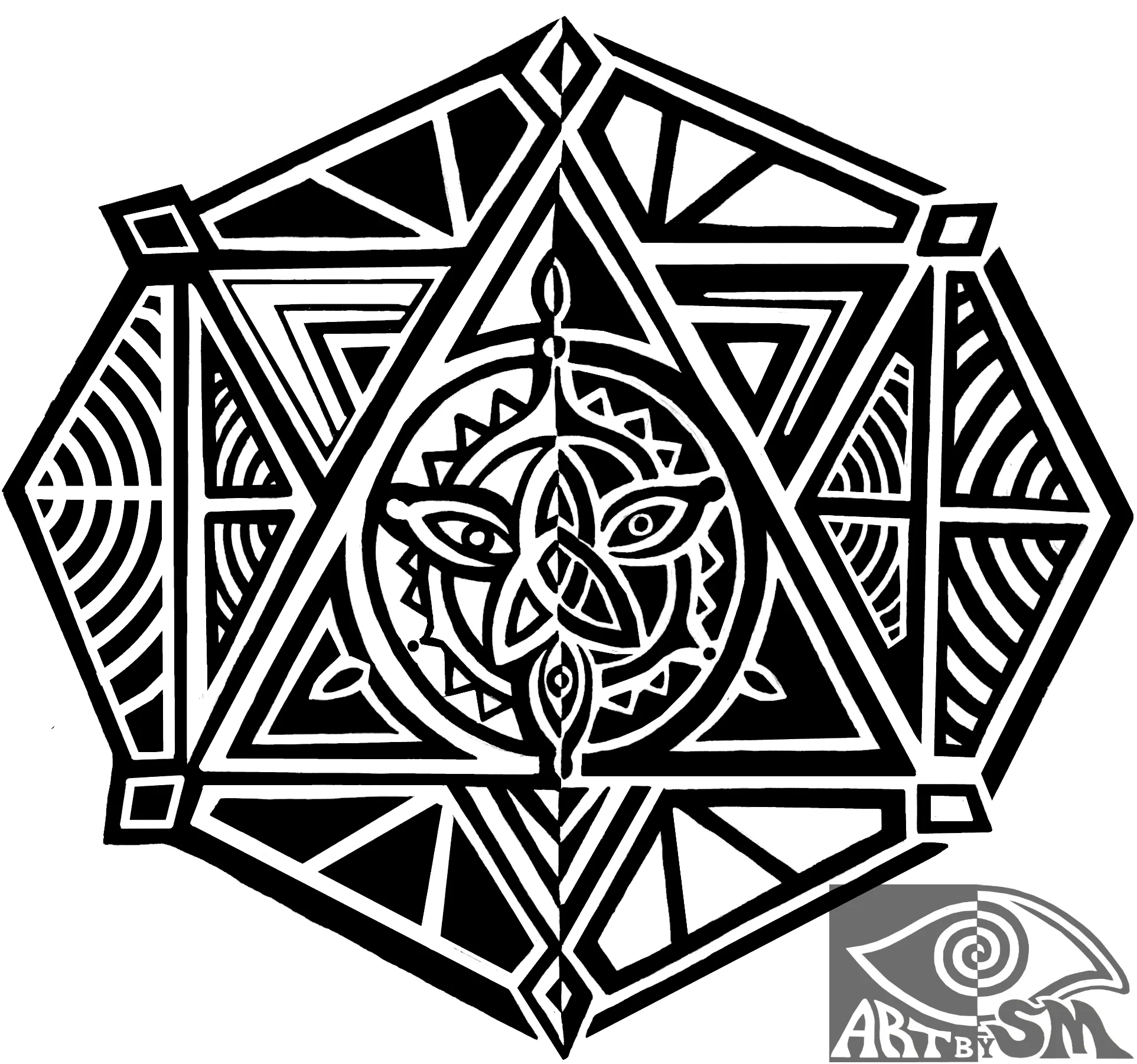
Conceptual Meaning: This was inspired by an ex lovers favorite cultures' symbols which I shared the same celtic love. Coming from an Irish and Scottish background, I feel as if celtic knots are an important symbol incorporated into my work. The triangle within the square within the octagon around was seen in the shower when thinking of the past.
TITLE: "EYES OF OUR I"
MEDIA: INK PEN, ACRYLIC PAINT PEN
SIZE: 21CM X 27CM
DATE: MAY 2015
Conceptual Meaning: This is my representation of the importance of eyes, as they are vital factors of our interpretation of our worlds. There are eyes interconnected in the center, starting the mandala-which expands into an eye flower.
"In our eyes I see the skies of visions that always haunt me."
TITLE: "NAKED ON THE PINE FLOOR"
MEDIA: INK PEN
SIZE: 11IN X 8.5IN
DATE: JANUARY 2015

Conceptual Meaning: Listen to Julia Stone's beautiful song, "Maybe." I saw this drawing in a vision I had while listening to this song, which tells a horrific story of a girl being taken advantage of on a pine floor. Inspired by modern day rape culture.
Formal/Technical Process: Drawn originally with ink pen and colored pens. I used minor computer editing (an online photo editor similar to MS Paint) to alter it. My outcome was similar to work of Banksy.
TITLE: "WATERFLOWER UPON MY BACK"
MEDIA: INK PEN
SIZE: 7IN X 7IN
DATE: APRIL 2015

Conceptual Meaning: I incorporated symbols of triangles and flower petals. This was similar to the design below but with an altered twist.
TITLE: "GODDESS POWER"
MEDIA: INK PEN
SIZE: 14IN X 10.5IN
DATE: MARCH 2015
Conceptual Meaning: This piece shows a story of a strong and dominant woman unlocking power through the hierarchical pyramids. I feel as if many individuals are unconsciously following this "road" to bliss, working our way up the pyramid in our jobs. We seem so confined in this metaphorical pyramid, but need to use our third eyes and see past that inhibiting path carved out for us to waste our lives being work-to-survive slaves.
TITLE: "AWAKENING DREAM DESIGN LOGO"
MEDIA: INK PEN, ACRYLIC PAINT PEN
SIZE: 9IN X 8.5IN
DATE: APRIL 2015
Conceptual Meaning: This brand was my initial idea of branding myself, but then I decided to just use my name. I have many ideas revolving around an "Awakening Dream Oasis" sanctuary that I am going to create- but more about those ideas will be on my blog.
TITLE: “CONSUMER CHAOS”
MEDIA: MAGAZINE PAPER CUT OUTS
SIZE: 13.5IN X11IN
DATE: JUNE 2015

Conceptual Meaning: This piece has an emphasis on external societal inhibitions that surround me which corrupt my internal sense of self. These thoughts inside my brain represent those reoccurring uncontrollable thoughts that are either self-inflicted or societally.
Formal/Technical Process: This was done by using clippings from knitting magazines all glued together on poster paper.
Title: "Death to Chance"
Media: Ink pen
Size: 11in x 8in
Date: December 2014
Conceptual Meaning: This is mainly directed toward eliminating the idea of us existing through chance. My main themes would be promoting fate and determinism.
Formal/Technical Process: The symmetry represents internal/external battles of balance. I intertwined the elements of symmetry representing internal/external harmony, brick walls to represent the blockage that we cannot control or prevent, and the third eye (of Horus) at the top of death, watching over and internalizing visions.